I wonder what sort of device you’re reading this on? A laptop? Maybe you’re at your desk reading the words on a cinema-sized display. Or – perhaps even more likely – you’ve got a smartphone in your hand and you’re thumbing through on your way to another meeting.
When you look around at the incredible plethora of devices on the market these days it’s not surprising that current market research shows mobile internet usage is set to dominate 2016.
Undoubtedly this change in the way people are consuming online information and viewing websites means we need to be considering how we engage with them to offer the best online experience for our brands and services. So what can we do to make this happen?
BACK IN THE DAY…
When mobile phones started to become internet enabled (remember WAP?) people wanted to access certain information on the move. Checking train times, the weather, or keeping up with the footy scores on a standard desktop site meant difficult navigation, large slow downloads, big bills and an all-round poor user experience.
Many businesses realised the need to cater for mobile users, and until fairly recently many opted for a separate “mobile” version of their website. You may have noticed a few yourself. You know, the ones starting with “m.somethingorother” instead of “www”.
These mobile sites were completely separate from their larger desktop siblings and have reduced functionality and content. This toned down version means users are only able to load and use the very basic of site content and functionality, and ultimately miss out on the information they may be expecting to find. Separate mobile sites come with logistical problems too – two sites equals two things to design, build and manage. That means ongoing cost and time implications and all for a less enjoyable experience for the user. Not a great solution?
Another issue with mobile sites was what mobile device do you build them for? There are too many different screen sizes and differing capabilities to do them all so which do you choose? How many would you need?
Well, with Responsive Web Design the answer is easy.
One.
WHAT IS RESPONSIVE WEB DESIGN?
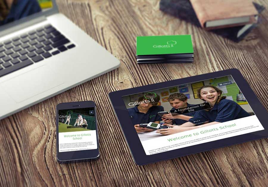
Responsive Web Design is a collection of techniques that allow a website to flex and adapt to the size of screen it’s being viewed on. Someone opening your site on a small smartphone will be shown the same site as the person opening it on their laptop but the site will have noticed the constraints and automatically reformatted to give the user an experience better suited to their device. No more loading a huge website and having to zoom in and out to find the content you’re looking for. Responsive web design takes into account interaction too and makes your site easier to use by acknowledging and integrating things like touch screens to aid navigation.
As the web continues to evolve it’s becoming ever more clear that the main driver to a website is not fancy-pants eye candy, but solid, valuable, and shareable content. Responsive design explores the implications of limited screen real estate and ease of access not only for structure but forces us to consider messaging and content on-site by adopting a ‘mobile first’ strategy.
MOBILE FIRST
Previously we designed for desktop users first, and a mobile version was either a far too minimal functional experience or we were trying to force too much of our desktop site into it unnecessarily. Deciding what is most important to a viewer on a mobile device with limited bandwidth, processing power and screen size means we get rid of anything diluting our main purpose or message and therefore, across all sizes of the site, we are focussed and concise in offering a better experience to our customers.
BENEFITS
So now (hopefully) you understand what responsive web design is, perhaps we should have a run down of the benefits.
Google score sites that are responsive higher than those that fail to display across mobile devices.
This is massive and only came into effect in the last 12 months. This means that if your site is not responsive Google may choose to display your competitors sites over yours if they have a modern responsive design. We will explore this further in another post…
Future proofing.
Responsive sites work well across the multitude of existing devices on the market. It’s a safe bet it will for considerable time to come (although no technology is forever!).
Better, faster, smarter user experience.
Optimizing your site no matter what the user chooses to view it on makes their life easier. Happier customers means a happier business.
Cost Effective.
Responsive sites take a little longer to put together, but they survive longer and the unified approach means management, support and upgrades only need be applied to one place. That saves time and money.
SEO optimised.
Managing SEO for separate mobile and desktop sites is hard and doesn’t produce great results. As Google recommends a responsive approach to combat these problems and a consolidated view of your results means more focus.
Improve conversion rates.
An optimised and consistent site, no matter what platform it’s viewed on, provides a better experience for the user which is more likely to lead to them engaging with you than going elsewhere.
WE ♥ RESPONSIVE WEB DESIGN.
Responsive web design isn’t a trend any more, it’s a must. Being able to offer consumers a beautiful optimised experience regardless of their choice of device means you’ll have expanded the reach of your service or business and the chances you have of engaging with individuals. The long lasting nature of this approach is incredibly valuable and the cost effectiveness is a clear advantage.